The Kalorama Collective
The Kalorama Collective has been empowering communities to rebuild and thrive since the disastrous storm of June 2021.
The mission is for The Kalorama Collective to become the go-to resource for community-led resilience and preparedness in the region. Ultimately, the brand seeks to inspire, empower, and unite its community, creating a lasting legacy of support, growth, and togetherness in the face of adversity.
Date: 2023 (student project)

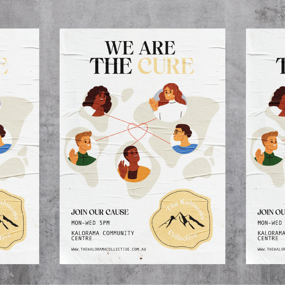
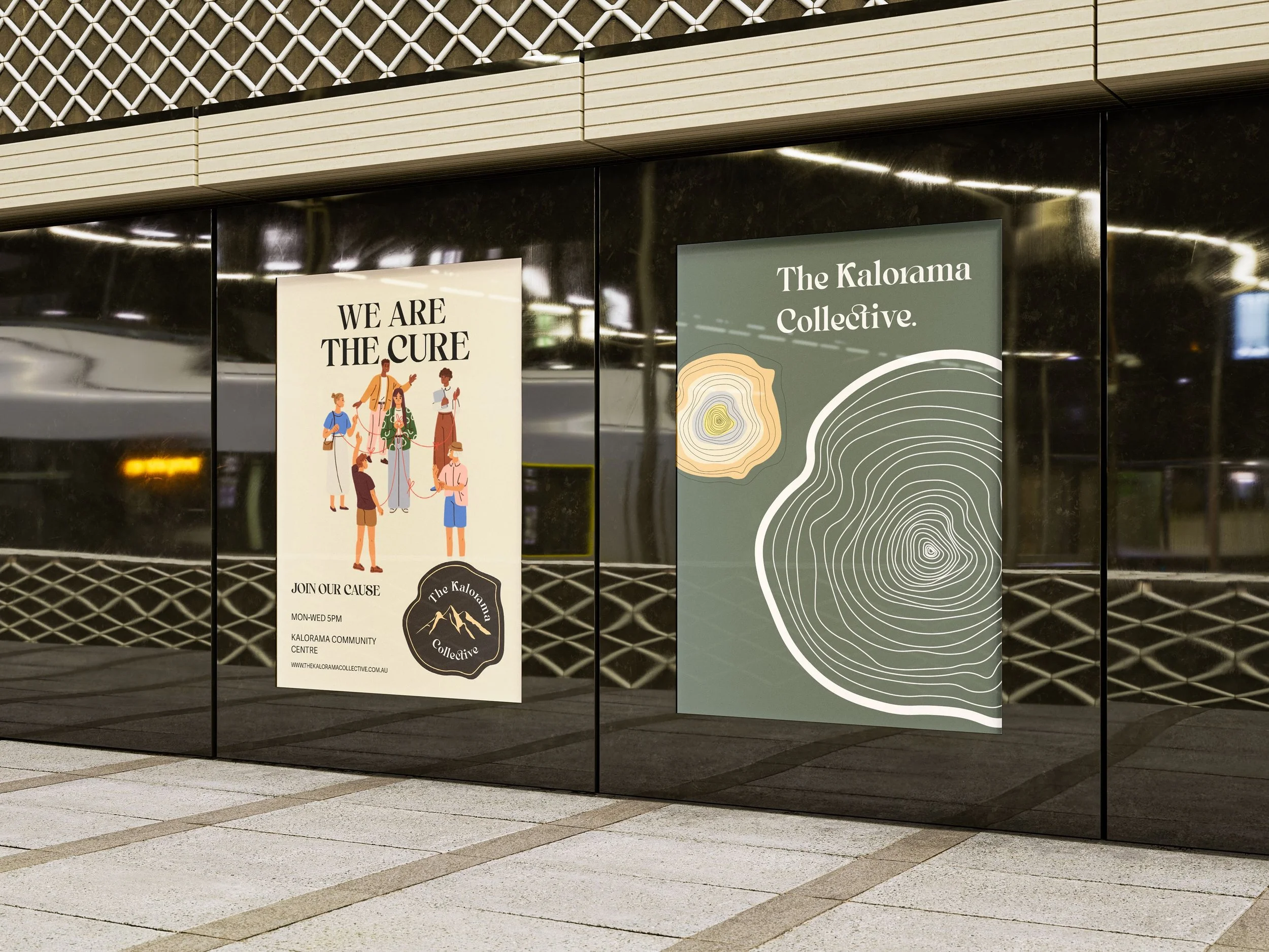
To be viewed as an organisation that focuses on community, resilience, empowerment, and progress, I focused on taking inspiration from the geography of the Dandenong Ranges, which is where the Kalorama Collective is based. Implementing symbols, colours and shapes from the environment and into the brand identity, evokes a feeling of belonging in locals, which might inspire them to become more active within their community.
Brand Identity
Logo
The logo of The Kalorama Collective is a powerful representation of the brand's mission and values. The black tree stump outline, adorned with a yellow border, is a symbol that represents growth and togetherness. It echoes the Collective's dedication to fostering community unity. The yellow mountain range at the heart of the stump is a direct homage to the Dandenong Ranges, highlighting the organisation's local roots and connection to the community. The white, curved brand name encircling the mountain adds a clean and modern touch and signifies a protective embrace. The logo effectively captures the brand's objectives by expressing unity, local connections, and a dedication to collective growth and resilience.


Merchandise


Colour Palette & Fonts
Pear
#EEE7D2
Pińa
#FFE794
Citrus
#FFD9A0
Olive
#B8B89D
Ice
#D3D8D4
Storm
#68736B

Graphics & Patterns





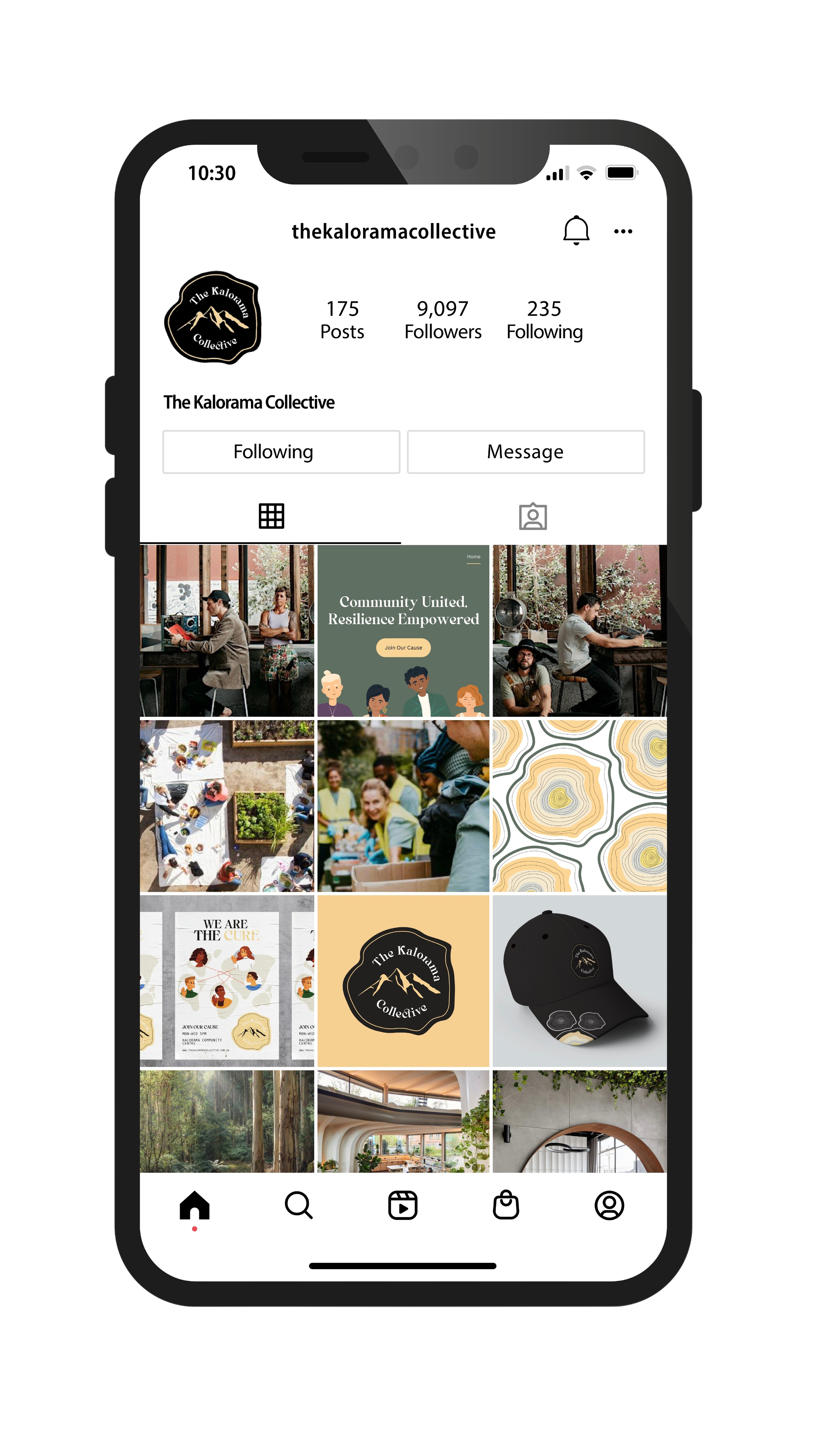
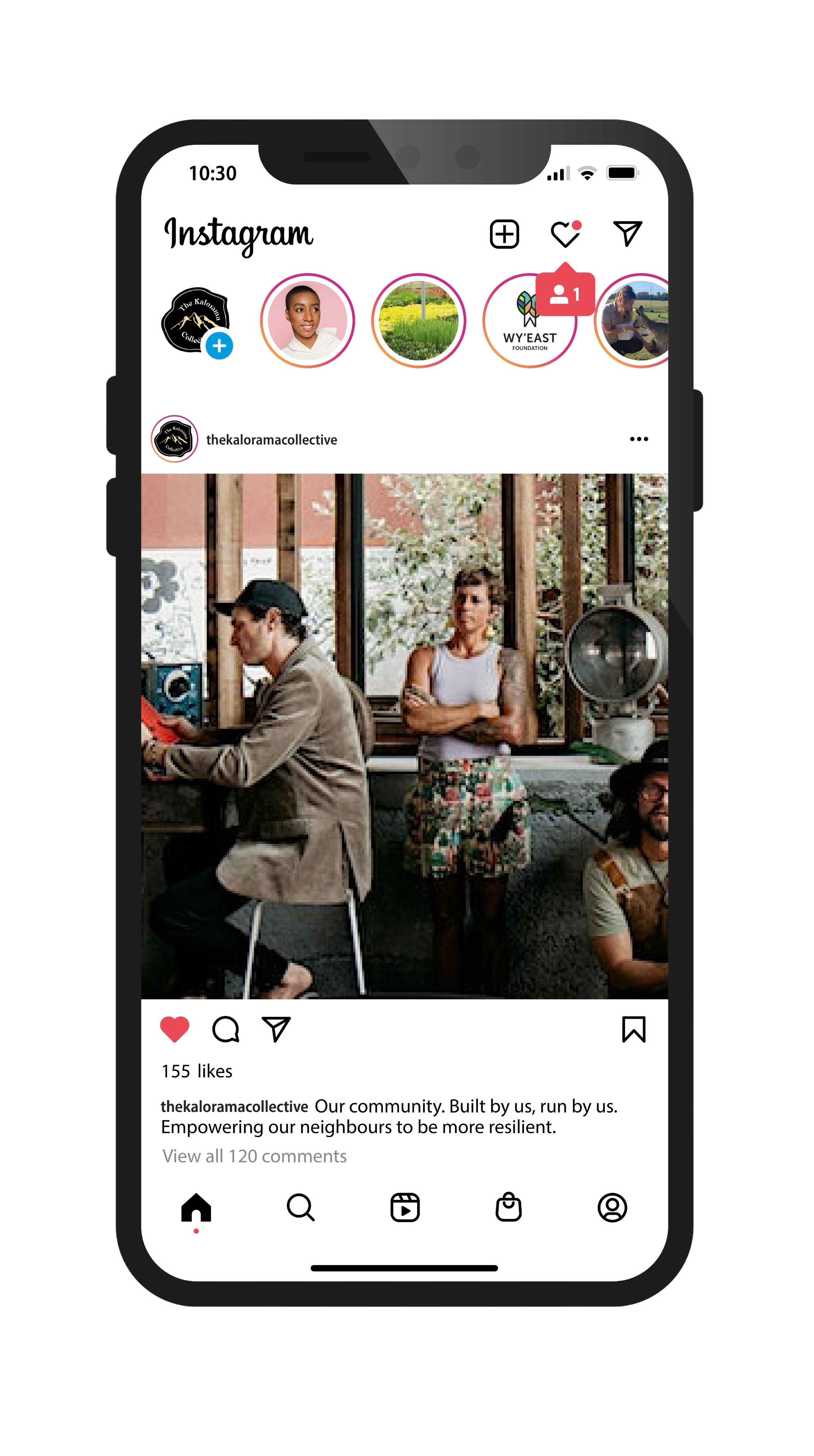
Social Media & Website

Posters
